General
The Email Templates module of CRM’s new user interface has a built-in editor for creating emails. The editor works easily and visually on the drag-and-drop principle, so creating an email does not require HTML knowledge. In addition to this, the editor automatically takes care of how the e-mail works on different end devices, and with the help of preview functions, you can check in advance how the e-mail looks on, for example, mobile devices.
Unlike in the mass mail portal, the email templates and the actual emails intended to be sent are built and stored in the same module; in practice, the type of e-mail determines whether it is a basic or ready-to-send e-mail.
The instructions below discuss creating a new e-mail template, but the editor works in a completely similar way for e-mails as well. The completed email template can be copied as the email template by clicking the  Actions button in the email template and selecting the Copy to email.
After the 1st of February 2024, the Powered By CRM-service logo will not be displayed if the customer is using the Mailing Tool Advanced or Professional product.
Please note that this only affects new email templates, and old templates and their copies will still have the Powered by CRM-service logo.
Creating a new email template
You can start creating a new email template completely in the Email Templates module by clicking the  New button. The following information must be defined for the new email template:
- Name – Only displayed in CRM. It is therefore not a subject of the e-mail that is visible to the e-mail recipients.
- Email template number – The number is automatically generated when saving, so you don’t need to fill it in yourself.
- Active
- Responsibility
- Description
Special attention should be paid to the following fields:
- Subject – Presented to email recipients as the subject of the email.
- Reply address – If the recipient replies to the email directly, the replies will be forwarded to this email address.
- Sender name – Presented to the recipient of the message as the name of the sender of the email.
The technical field information of the e-mail (if visible) does not require action; the fields are filled in automatically when the e-mail content is created in CRM’s own editor.
Quick-Step Guide:
- Right-click the link to copy it by selecting Copy link address from the appearing menu.
- Paste the link to the browser’s address bar by using Ctrl+V or right-clicking and selecting Paste. Alternatively, you can select Paste and go to -option to open the link at the same time.
- Press enter to follow the pasted link.
Export the email as PDF
Sometimes you might want to check if links work by using a file where you can preview the email template. This is possible by printing the email template as a PDF by following the instructions below. Even though the instructions talk about printing, this means that the wanted template is saved to the computer as a PDF file.
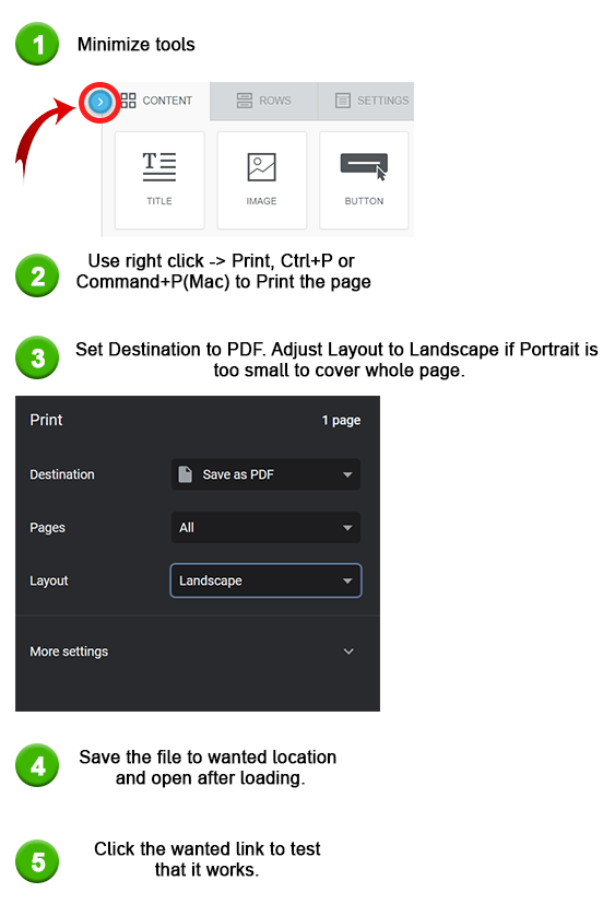
Depending on the layout of the template minimizing tools or adjusting the layout might not be necessary. Testing PDF export with different settings will show in the preview which works best on the selected template.
If the printing does not give you the Save as PDF option, this means that the feature to do this in your operating system is not active. To find out how to turn it on, look for guides for it from the page of your operating system provider.
Editing content with the editor
The actual structure and content of the e-mail template/e-mail is created using the e-mail editor. The editor can be opened by clicking the Actions button and selecting Edit content.
The editor tools have three tabs: Content, Lines, and Settings. Find out more about these possibilities below.
General functions in the editor
In the lower-left corner of the e-mail editor, there are buttons for the editing history and for the previous and next action. With these, it is possible to undo and redo the most recent changes made to the email or jump back to a certain point in the change history.
In the upper left corner, on the other hand, there are functions for previewing the email in desktop and mobile views and for detailing the structure of the email.
Settings
On the Settings tab, you can find the general settings of the email template, such as the width of the content area, alignment of the content, and the background colors of the entire email and the insert area. In the settings, you can also define the default font and the default color of the links.
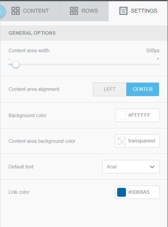
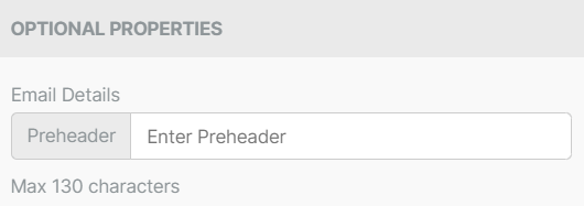
In the Optional properties section of the settings, you can find the Email Details. You can enter a preheader text here.
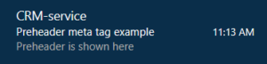
This preheader text will be displayed to the email recipient below the sender and the email title (in the image below, the preheader text is shown at the bottom).
Rows
The e-mail template is built line by line in the editor and adding new lines to the e-mail is done by dragging the appropriate line option from the Lines tab to the e-mail. Line options have ready-made lines divided into different columns; with the help of columns, it is, therefore, possible to place different elements, such as an image and text, next to each other on the same line in the email.
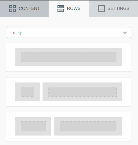
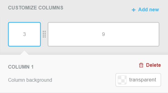
After adding a row, clicking on the row to the right displays the Properties of the row (see image below), which has the following setting options:
- Row Background Color – The background color of the entire row.
- Line background image – The image displayed in the background of the entire line (Note! Not all e-mail programs support background images; in this case, the background color of the line is displayed instead of the image).
- Content background color – The background color of the content area.
- Customize columns – New columns can be added to the row with the Add new button and the size of the columns can be modified by dragging. You can also Post an unnecessary row by first clicking on the column and then the Delete button.
- Padding – Padding allows you to add more space to the column. Air can be added simultaneously in all directions, or by clicking the Add options function, the additional space can be defined separately for each page.
- Border – With the border, you can add edges to the column in the desired color. The border can be set for all pages at once, like filling, or separately for each page if necessary.
Contents
Elements for the actual content can be dragged from the Content tab to the rows and their columns in the e-mail (see image below).
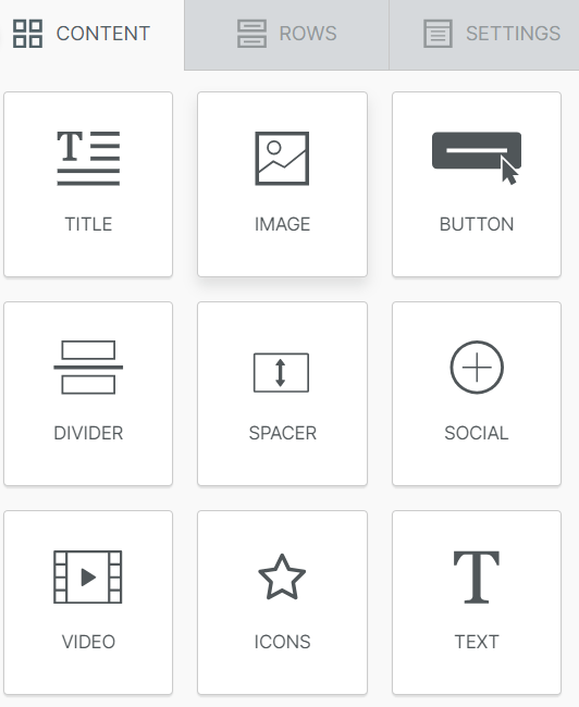
After adding an element, by clicking on the element, the Content properties appear on the right side, with which the element can be modified as desired. More about the properties of each element are below.
Title
- Title type – By default, the user can select H1, H2 or H3 header.
- Font family – Global font by default, but can be changed to other fonts.
- Font weight – Bold by default.
- Font size – By default, automatically set to match the header type, but customizable by the user.
- Text color – freely selectable.
- Link color – freely selectable.
- Align – options are aligned to left, aligned to centre, aligned to right and aligned to both margins.
- Line height – how much space to leave between lines.
- Letter spacing – how much space is left between individual letters.
- Text direction – whether the text is to be read from left to right or right to left.
- Block options – determines how much space to leave at the edges of the header. The user can either adjust all margins at once or by clicking on the More options to be active, the user can adjust each margin individually.
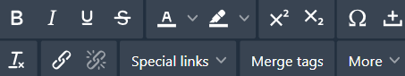
When the title is typed, a text editor for the title is also displayed, from which certain properties can be adjusted. The name of a property can be displayed by placing the mouse over the property icon.
Image
- Image size adjustment – The image size can be set to be determined automatically, whereby the editor sets the image size to fit the area. If necessary, the automation can be turned off, in which case the image can also be made smaller.
- Trim
- Picture link – The web page or function that opens when you click on the picture.
- Padding – Padding allows you to add more space to each side of the image (this potentially reduces the size of the image). Air can be added simultaneously in all directions, or by clicking the Add options function, the additional space can be defined separately for each page.
Button
- Type of link – The web page or function that opens when the button is clicked.
- Width – The width of the button can be set to be determined automatically, in which case the editor will estimate the appropriate width for the button. If necessary, the automation can be turned off, in which case the button can also be made narrower or wider.
- Background color
- Text color
- Trim
- Row height
- Letter spacing
- Border Radius – Corner rounding.
- Content padding – Padding allows you to add air between the text and the borders, i.e. practically increase the size of the button. The filling can be added simultaneously in all directions, or by clicking the Add options function, additional space can be defined separately for each page.
- Border – Border allows you to add borders to the button in the desired color. As with filling, the border can be set for all pages at once or, if necessary, for each page separately.
- Inflation – The block settings can be used to add air around the button. The filling can be added simultaneously in all directions, or by clicking the Add options function, additional space can be defined separately for each page.
Divider
With the divider, you can divide the page into parts and thus make reading easier.
- Line – Line style, thickness, and color.
- Width
- Align
- Padding – Padding allows space to be added around the divider. Padding can be added simultaneously in all directions, or by clicking more options, additional space can be defined separately for each page.
Spacer
The spacer can be used to insert empty space between elements in an email without the user having to adjust the padding properties of the elements. The spacer covers the entire width of the email.
- Height – how much space the spacer fills.
Social
The social element contains a collection of social media buttons. By default, the function displays certain icons, but it is possible to remove unnecessary icons and add new ones with the Add new icon function.
- Style of icons
- Icon URL – The web page or function that opens when the icon is clicked.
- Icon title and alt text – Can be displayed with the More options function.
- Trim
- Icon spacing
- Padding – With padding, space can be added around the row of images. Padding can be added simultaneously in all directions, or by clicking the more options function, additional space can be defined separately for each page.
Video
- Video URL – enter the address of the YouTube or Vimeo video of your choice.
- Title – the text that the recipient will see in their email when they hold their mouse pointer over the video.
- Play icon type – the appearance of the play icon that will appear on top of the video.
- Play icon colour – whether the icon to be used is dark or light.
- Play icon size – selectable between 50-80px
- Block options – determine how much space to leave around the edges of the video. The user can either adjust all edges at once or by clicking on the More options option, the user can adjust each edge individually.
Icons
The icons work with the same idea as the icons of the Social element, but instead of the ready-made list, it is possible to add completely freely defined images as icons, and text can be defined next to the icon if desired.
- Icon – An image that is represented as an icon.
- Icon URL – The web page or function that opens when the icon is clicked. Possible to display with More options.
- Icon title and alt text – Can be displayed with the More options function.
- Icon text – The text is displayed next to the icon. Possible to display with More options.
- Font and font size
- Text color
- Align
- Spacing
- Padding – By filling in the block settings, it is possible to add air around the icon/row of icons. The filling can be added simultaneously in all directions, or by clicking the Add options function, additional space can be defined separately for each page.
Text
- Text color
- Link color
- Row height
- Letter spacing
- Padding – Padding allows you to add more space to each side of the text. Air can be added simultaneously in all directions, or by clicking the Add options function, the additional space can be defined separately for each page.
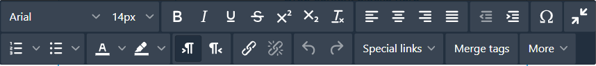
A text editor is also used for the text element (see image below), which appears above the text element during the writing phase.
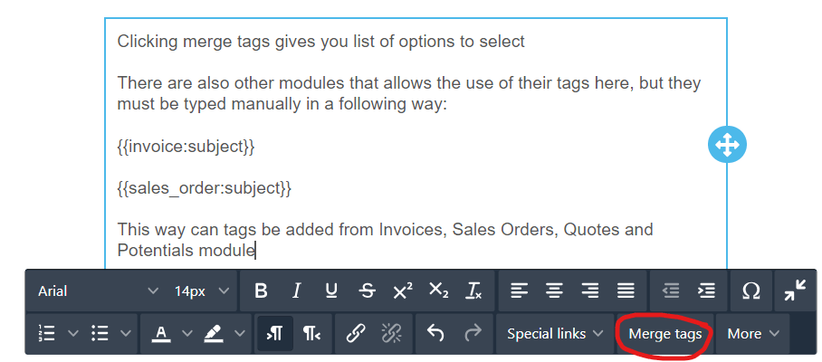
Adding tags to emails
It is possible to add information to the email templates using tags, and this can be done in two ways.
The first option is to click the merge tags button (circled in the image below) and then select the wanted module and field combination from the list.
The second option is to type module and field combination manually, and this must be used with modules Invoices, Sales Orders, Quotes and Potentials. These tags are always added using format {{module:field}} (see example below).